VDS embodied the concept of the brand’ openness and matureness in the updated exterior of the Helios filling station network
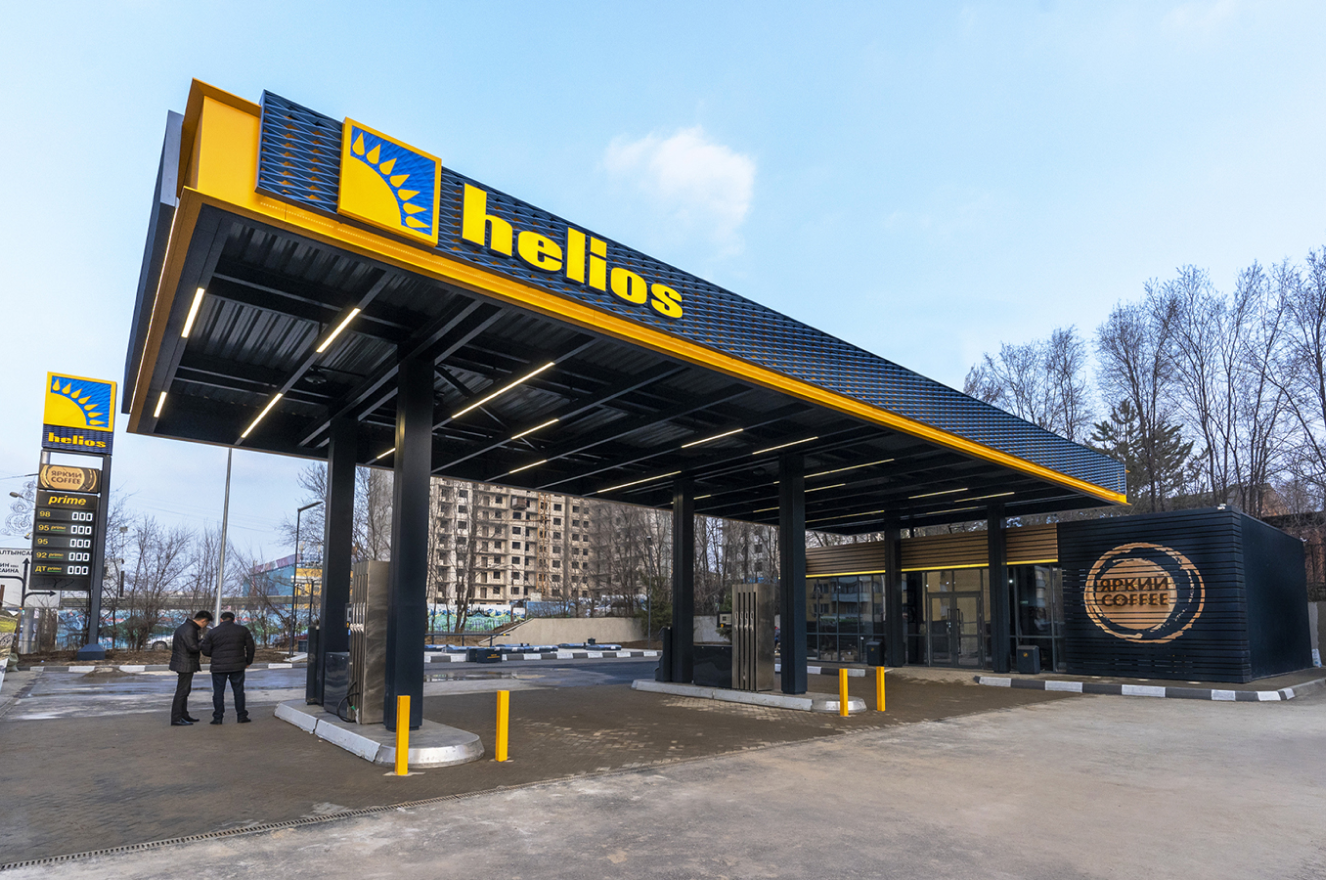
In early March, in Alma-Ata, Kazakhstan, the reconstruction of the first Helios filling station in an updated corporate style was completed. In 2019, the VDS project team updated the corporate identity of the Helios filling station network. At the beginning of 2020, VDS developed and produced the RVI in an updated style with subsequent installation during the reconstruction of the filling station.
01. 05. 20
HELIOS Company
HELIOS Company was established in September 1999 and specializes in retail and wholesale sales, supply of petroleum products in the regions of Kazakhstan. Since the founding of the company, a strategy of expanding of its own filling stations network has been developed. In 2020, the Helios Company owns: 270 filling stations in 61 settlements, 255 mini-marts at filling stations, 55 oil change points, 8 quality control laboratories, 26 oil depots. The company employs 4,863 highly skilled specialists.
The concept of developing of Helios filling stations network
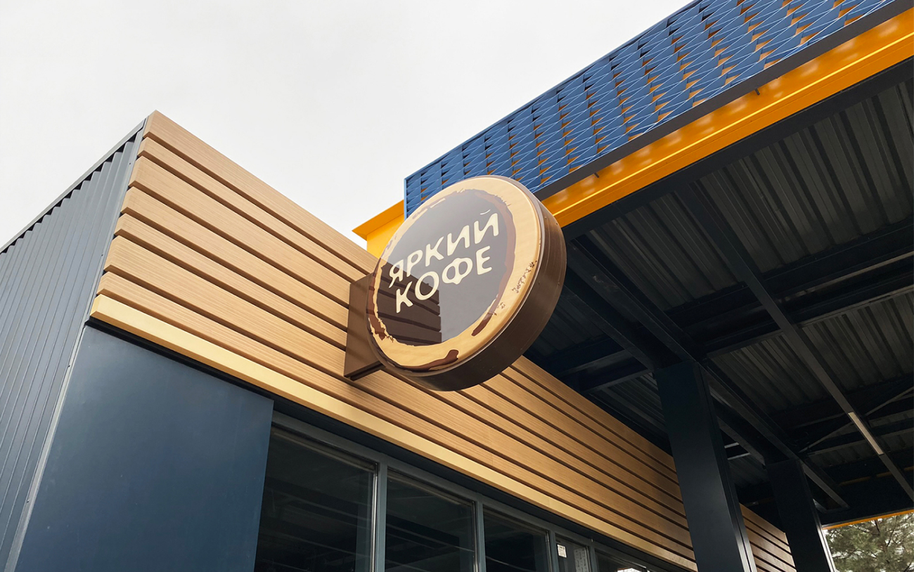
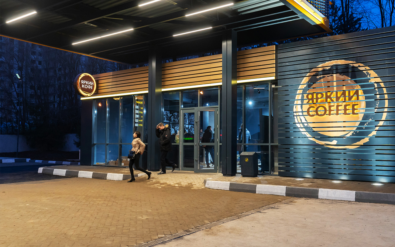
The renewal of the corporate style of the filling station network was the continuation of a next stage in the development of the Helios fuel retail asset in Kazakhstan. The basis was the concept of developing of Helios filling stations network, with the core idea summarized by the expression: “openness to people, business transparency”. Now this concept is demonstrated by the filling station architecture itself. In RVI-structures, VDS specialists embodied the idea of transparency and internal light effect. The building at the filling station was transformed into a cafe under the “Bright Coffee” brand.
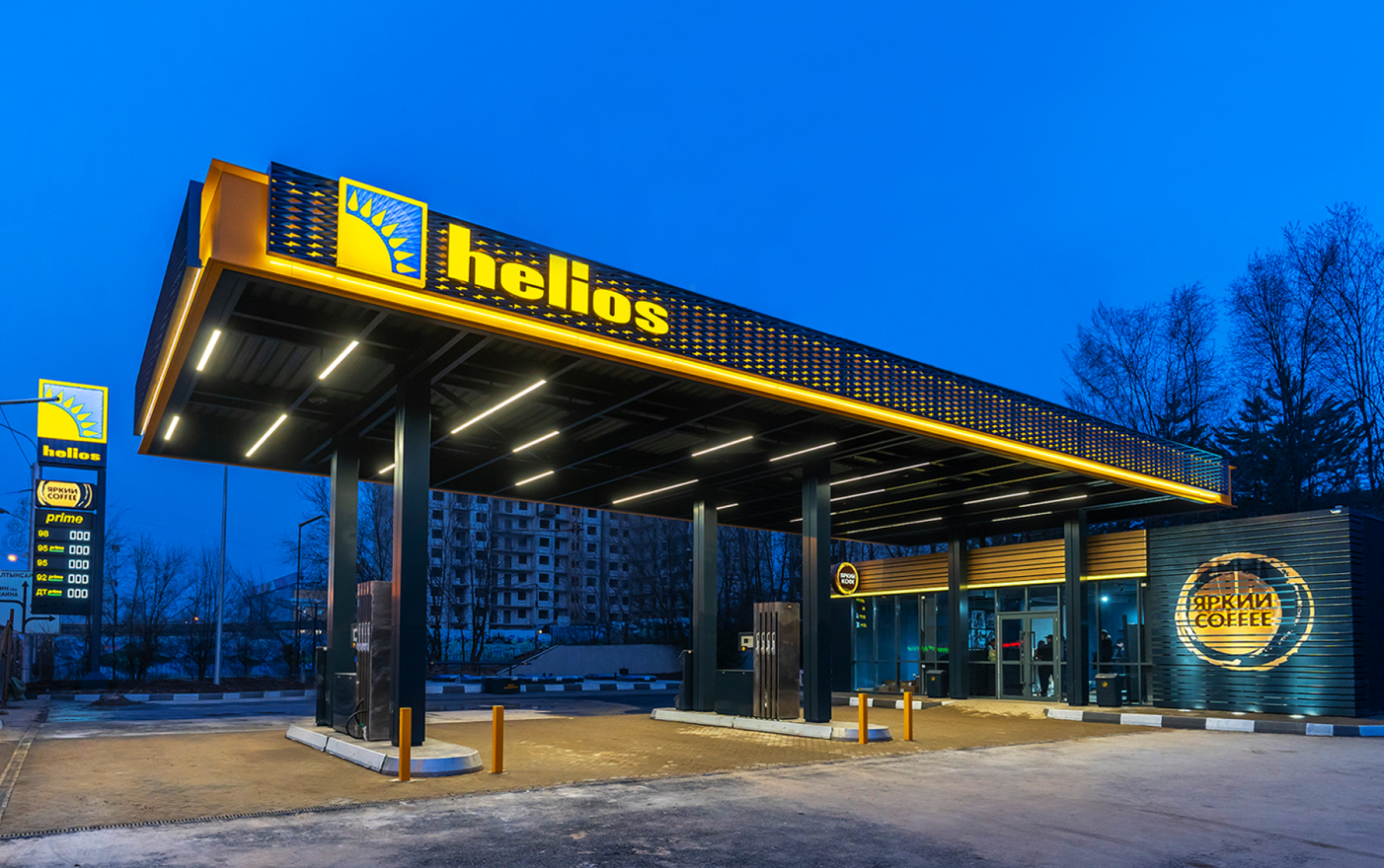
The new color-grade of retail visual identity (RVI) structures for Helios filling stations
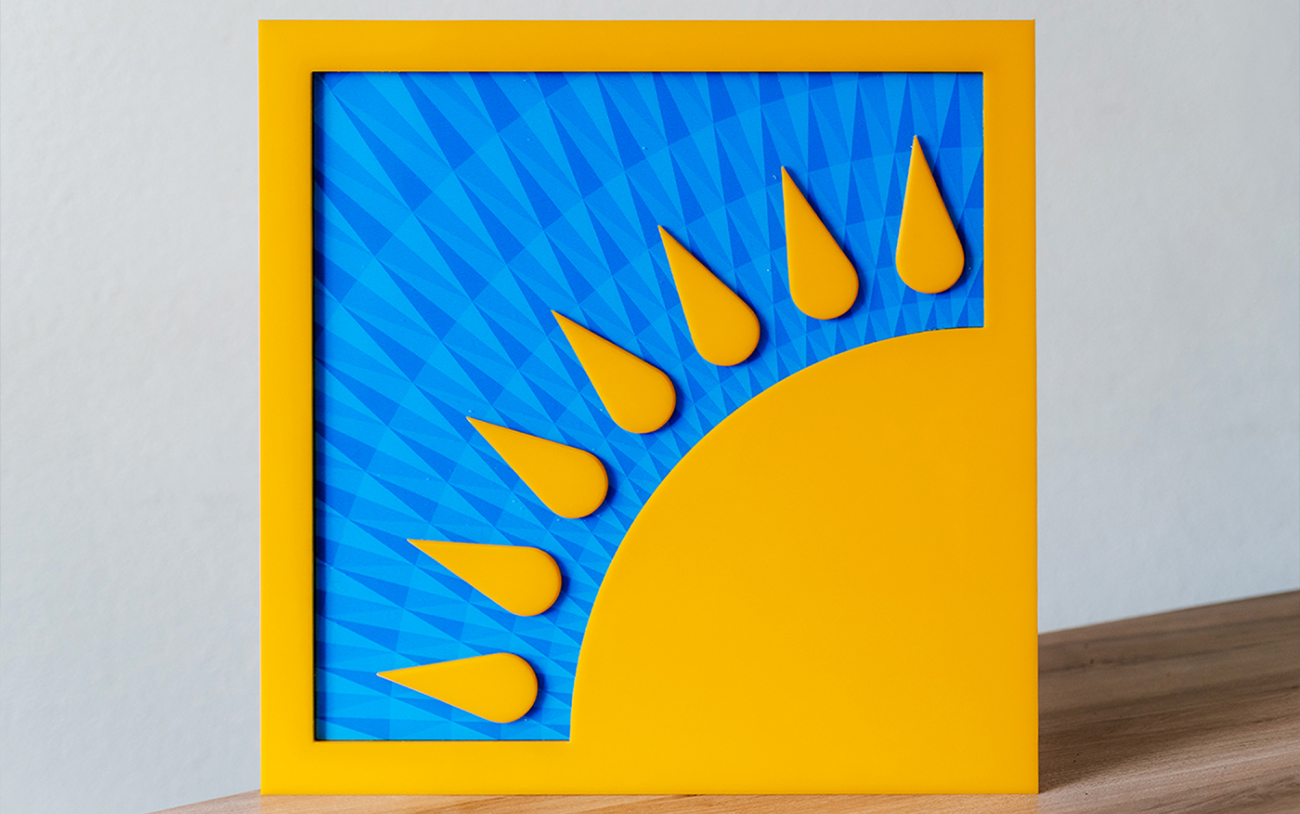
The new color-grade of retail visual identity (RVI) structures for Helios filling stations demonstrates the maturity of a brand that has been successfully developing on the national fuel retail market for more than 20 years. Helios status is now emphasized by restrained, urban colors. Sunny yellow, pure blue colors, as well as symbols on the logo sign, canopy and totem – kept the emphasis on the nationality of the Helios network (the continuity of the previous corporate identity).
