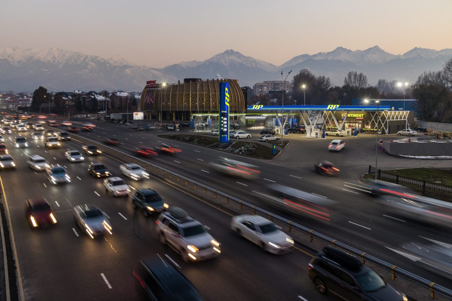
Design for Royal Petrol Design for Royal Petrol gas stations
VDS company has carried out a large-scale work on the development of a new corporate identity for the Royal Petrol retail chain. Royal Petrol LLP is the largest network of modern gas stations in Almaty and Almaty region, which today consists of more than 70 gas stations.
Project start
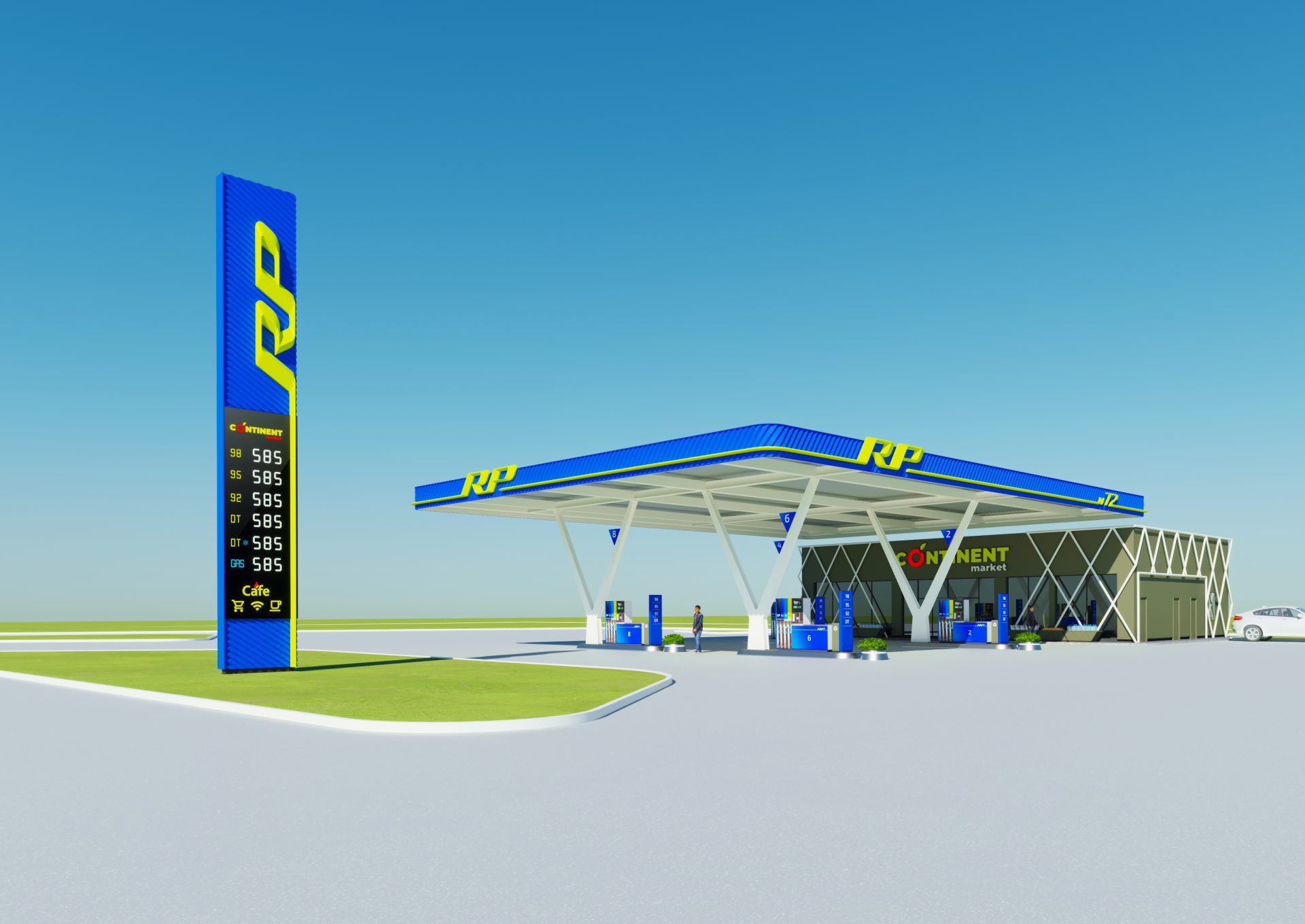
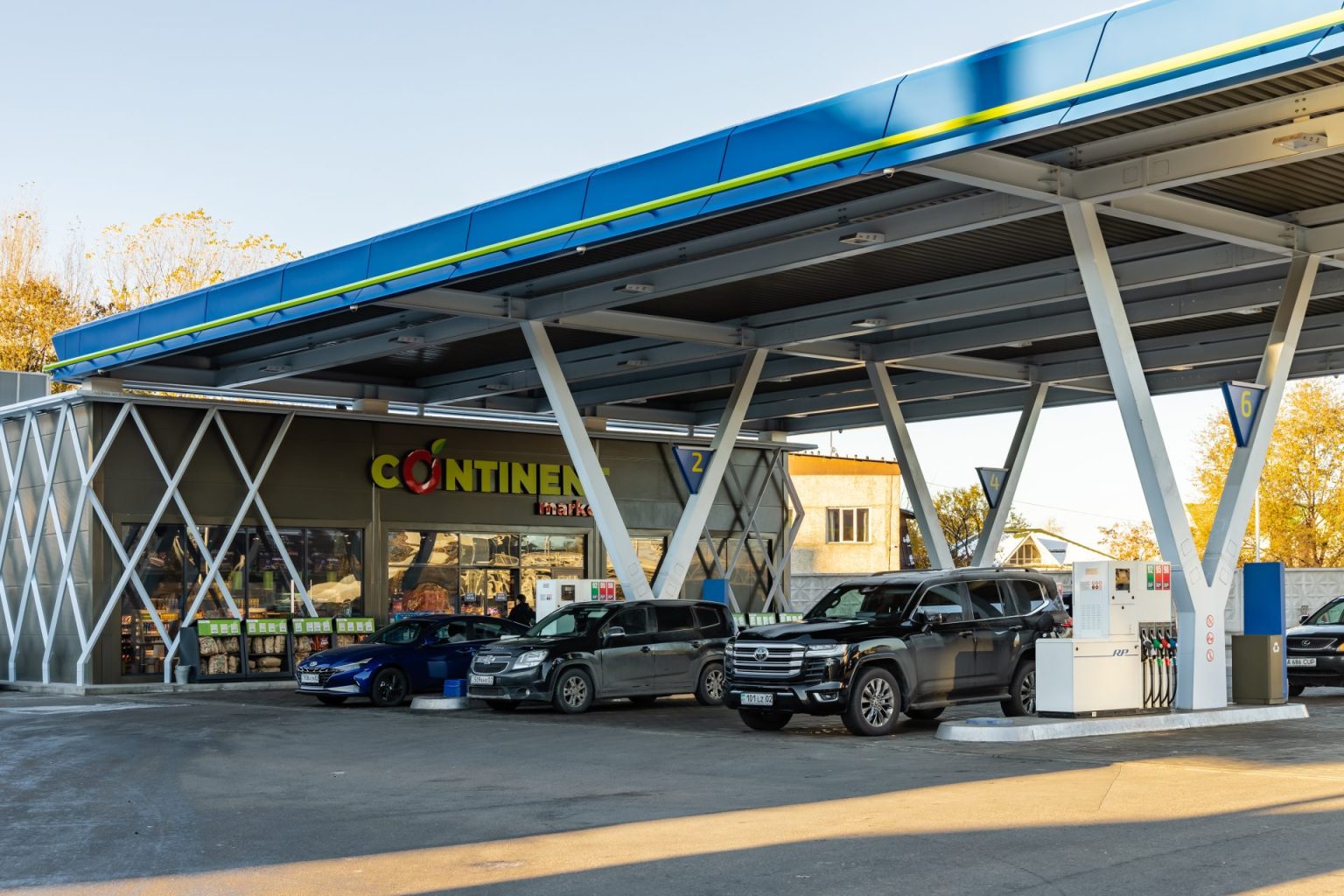
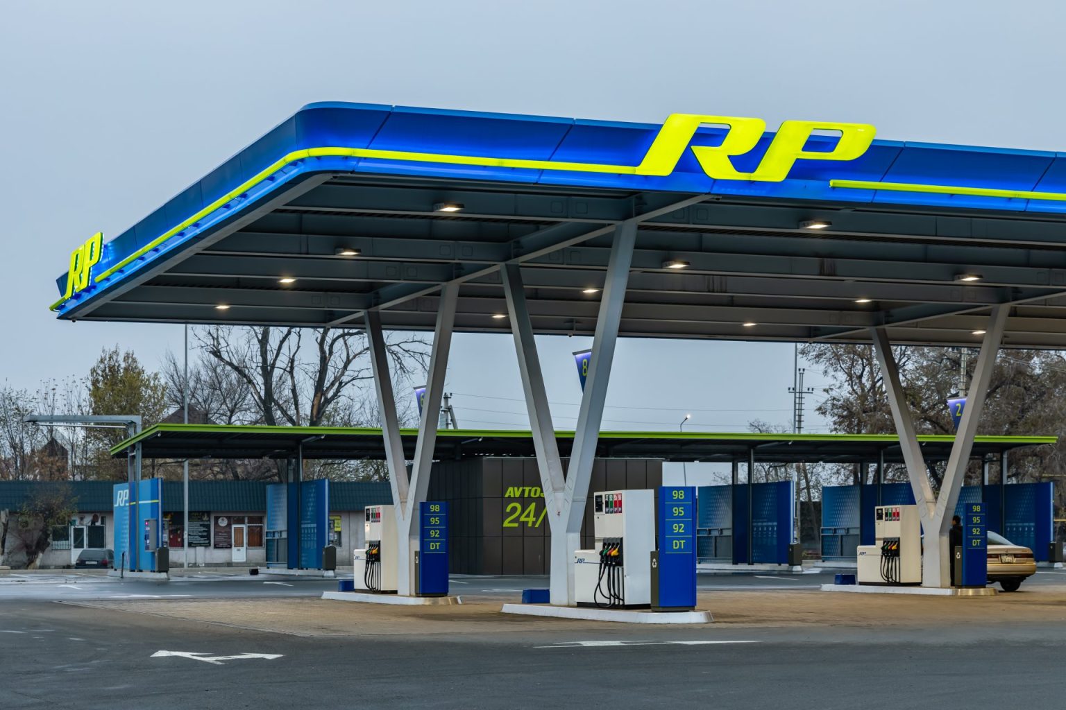
After analyzing the regional characteristics and the competitive environment of the Customer, VDS Company set itself the task of creating a corporate identity for gas stations that would achieve high emotions: spectacular design and memorable architecture of filling stations.
Color and light
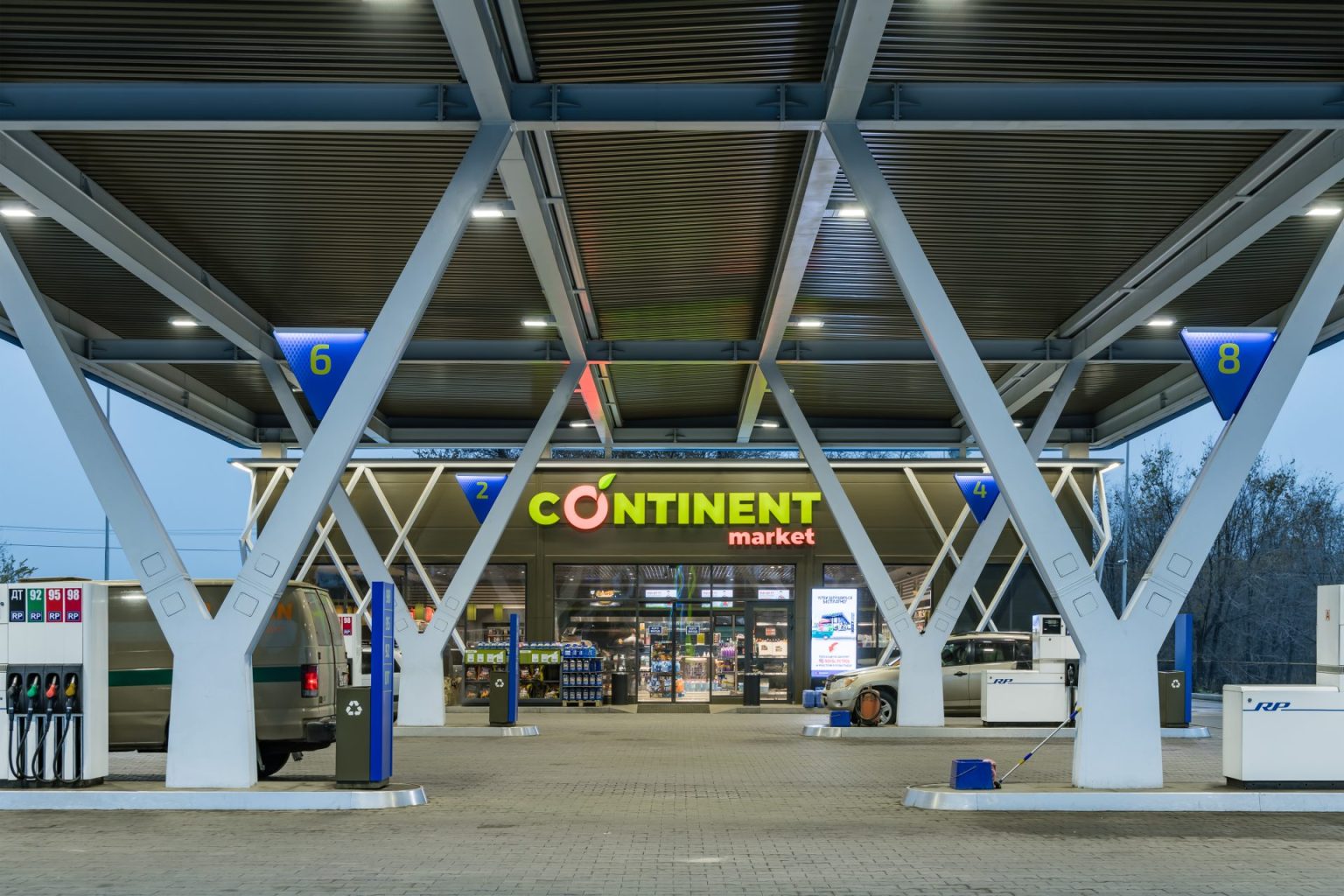
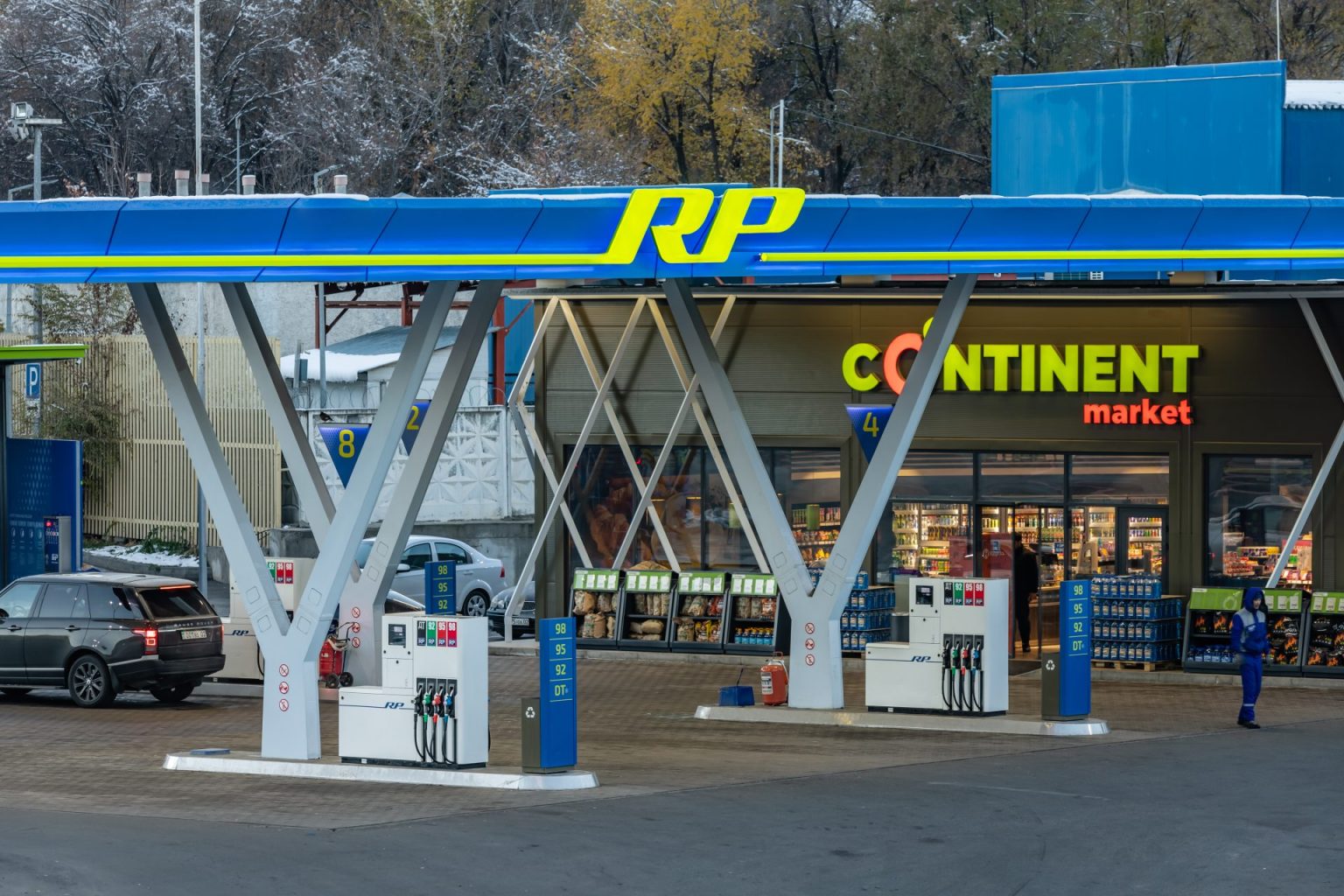
The color scheme of the Royal Petrol corporate identity reflects Eastern philosophy. Deep blue reflects the brightness of the sky and the depth of mountain lakes, luminous green is associated with the spring power of the steppe grass.
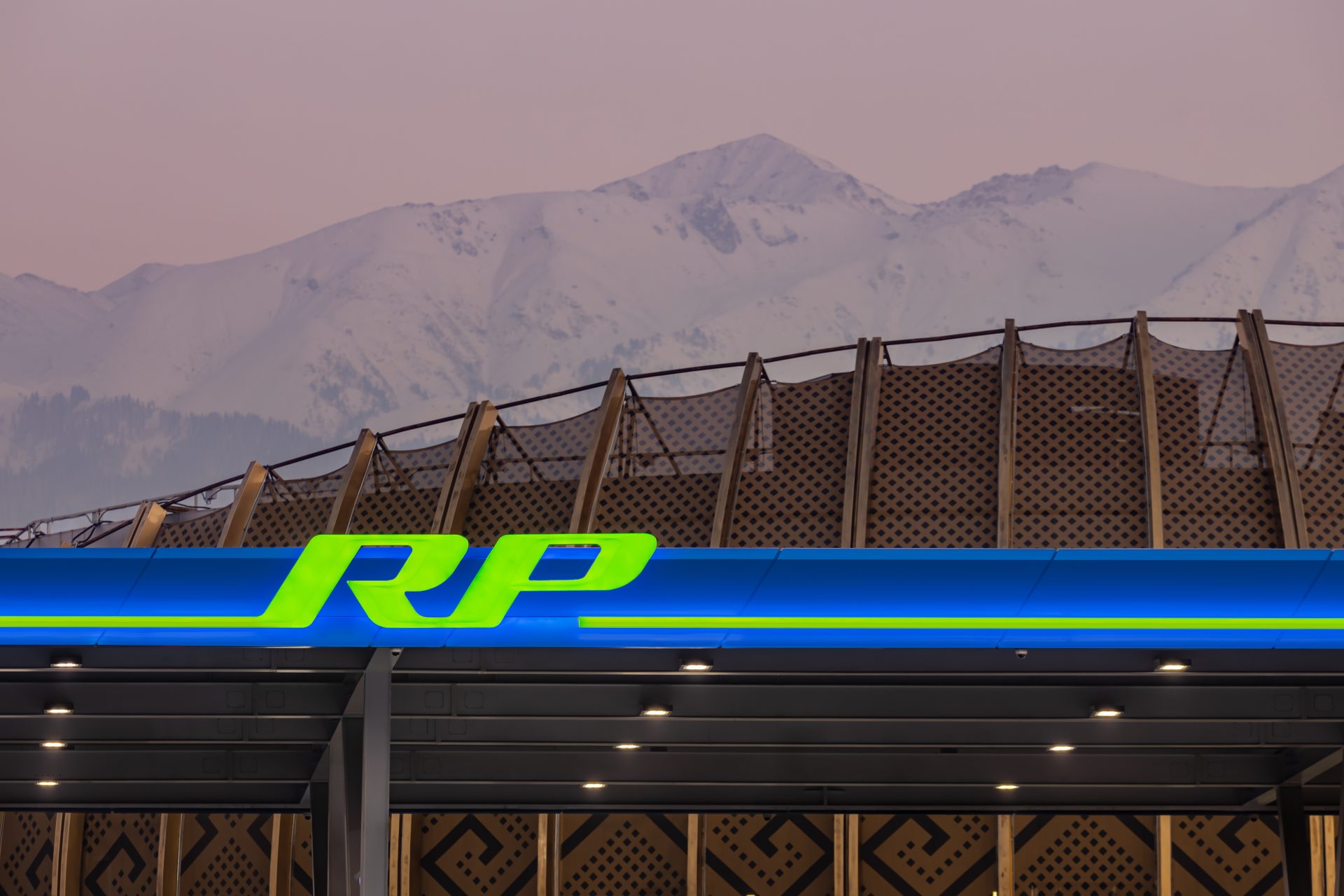
We used a non-standard color palette according to the Swedish NCS system and achieved its reproduction in various materials and glow, which allows you to see the gas station in the mountain fogs and smog of Almaty.
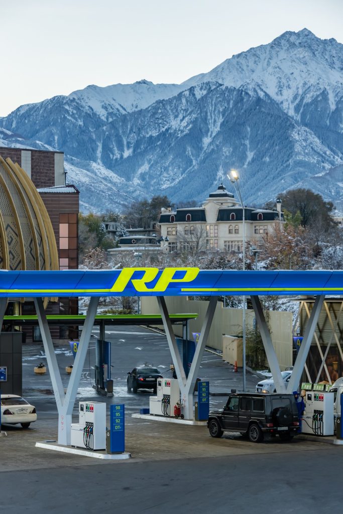
Architecture
- Precision designs inspired by the traditional kerege at the base of the Kazakh yurt, and the graceful V-shaped design of the canopy supports.
- A special sectional shape of the light profile, which ensures a smooth transition of the letters "R" and "P" into a line of bright light on the stele and canopy.
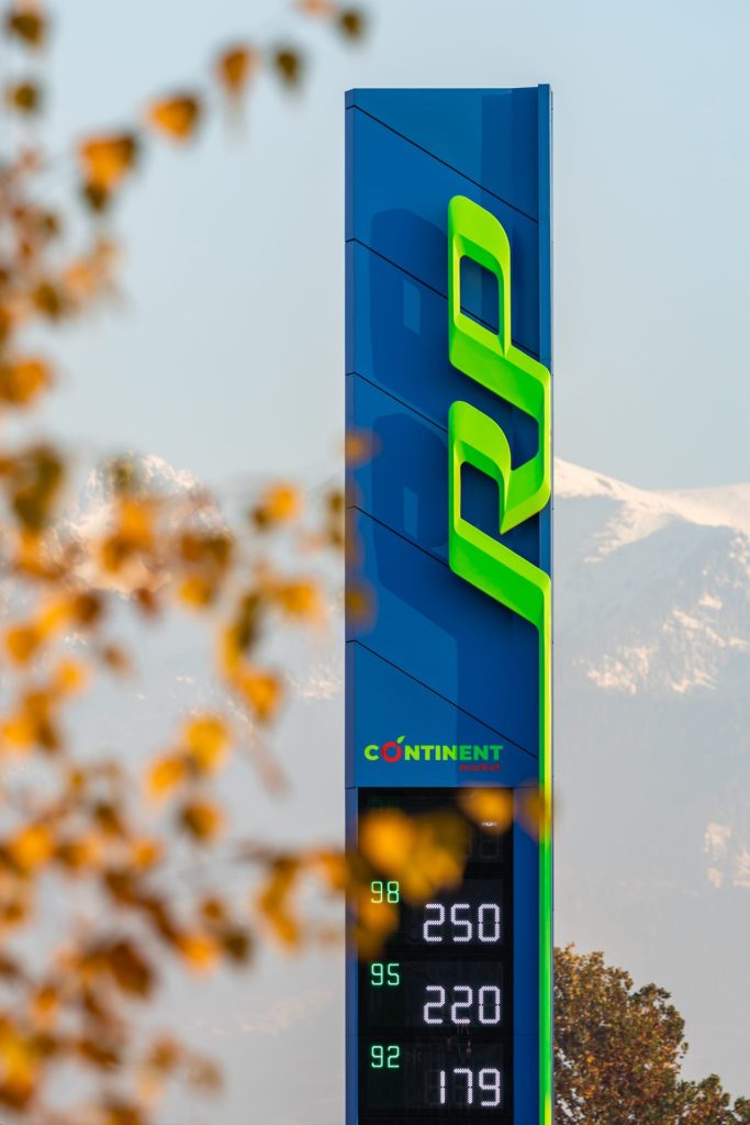
- The cross section of the stele tablets is of non-standard shape, the logo is rotated by 90°.
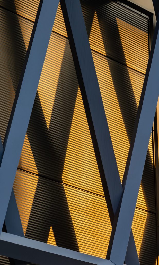
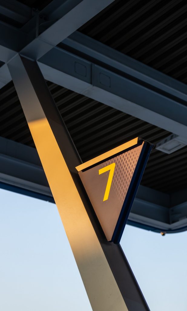
Attention to technologies and materials increases the service life of the facility up to 10 years. The updated corporate identity creates an attractive image of the Royal Petrol Company.
