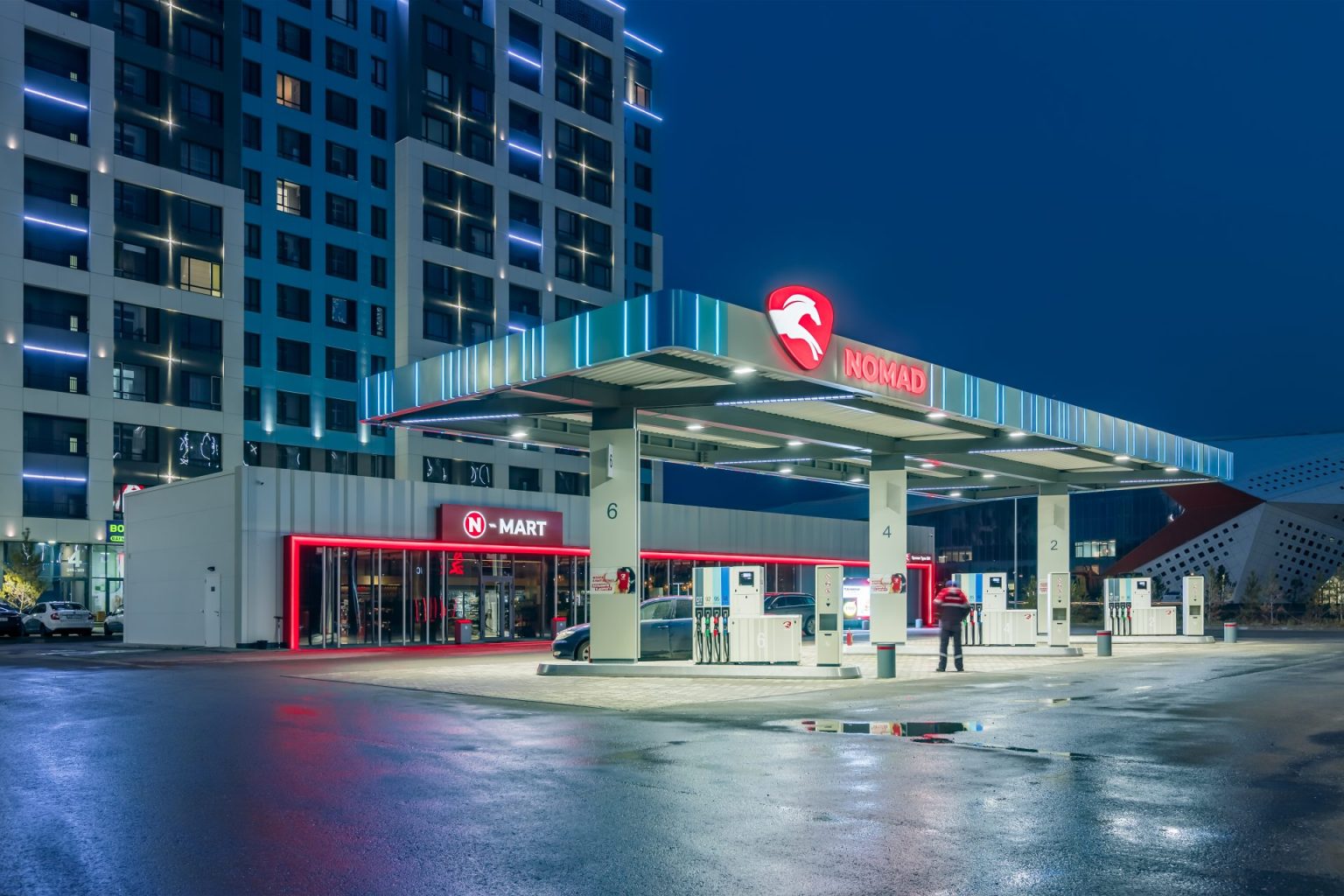
Corporate identity of "Nomad"
The network of gas stations "Nomad Oil" has existed in the market of Kazakhstan since 2008.
In October 2021, VDS carried out a comprehensive development of the gas station architecture. We simplified the name of the network to a more concise one - “Nomad”, which means a nomad, and developed a brand.
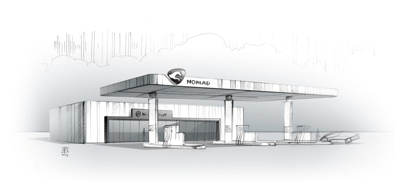
Minimalism in architecture
An open canopy, non-standard columns, a color combination that will make the station stand out against the backdrop of the Kazakh steppe. Type-setting panels set the rhythm for the entire gas station complex.
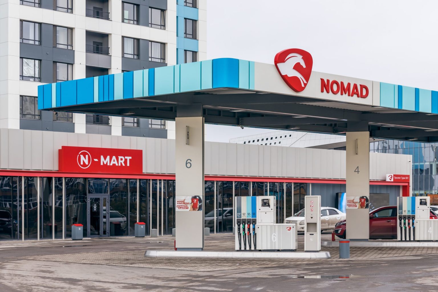
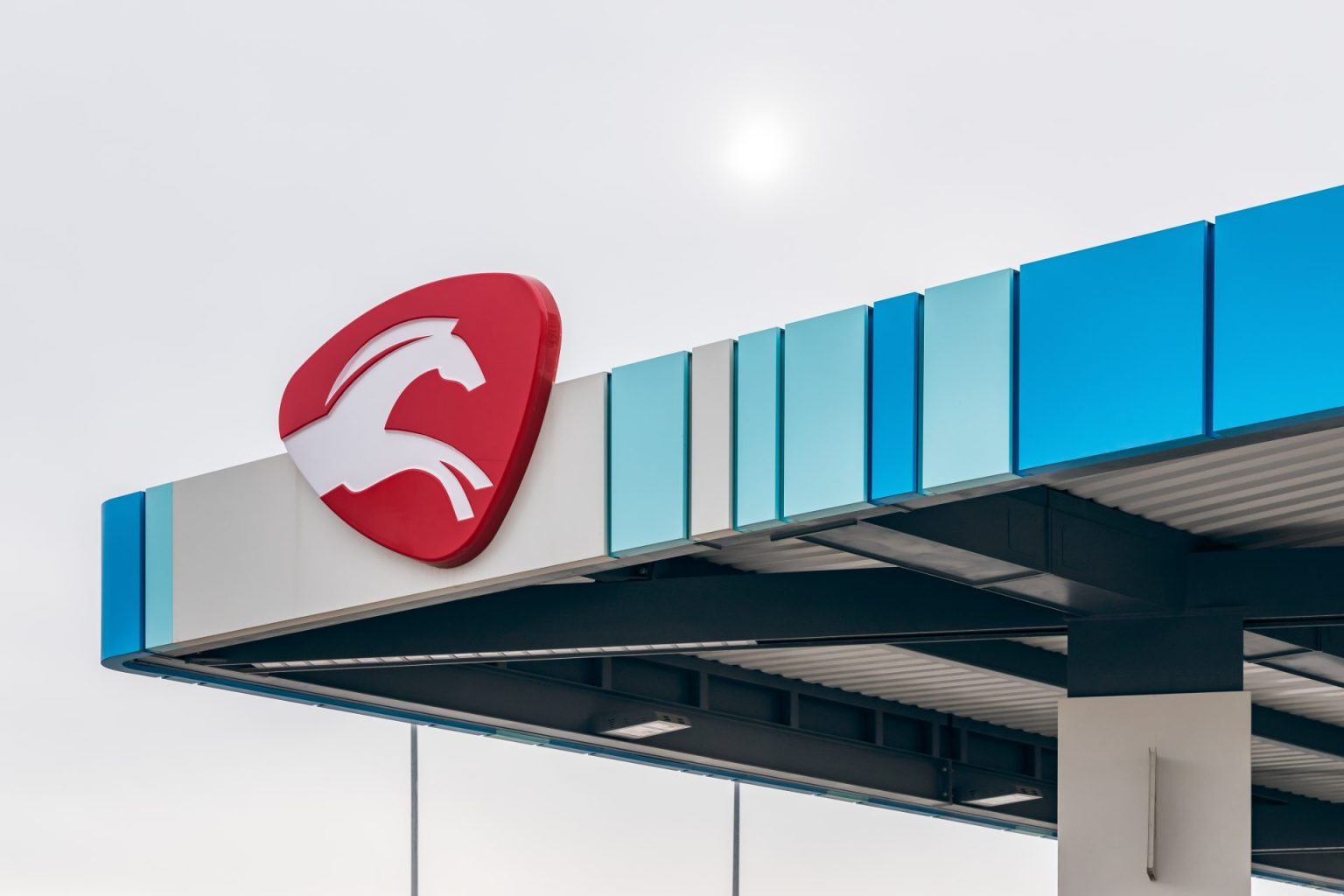

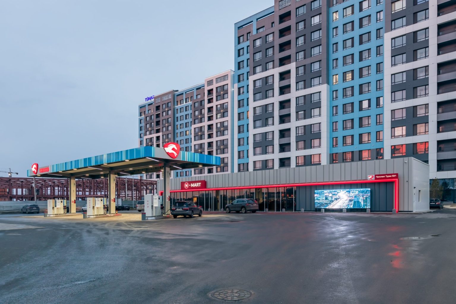
Color and night view
The building is purposely made in a warm range of colors, as if it invites you to a cup of coffee. A gradient achieved with the help of technology; smooth transition from turquoise to beige even at night. The red logo is noticeable at any time of the day.
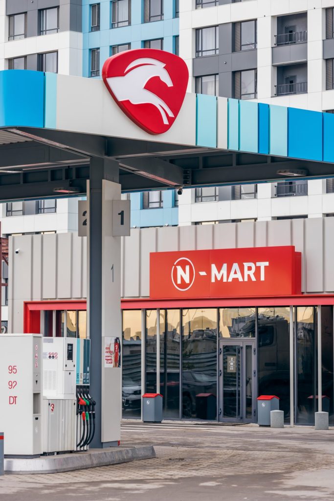
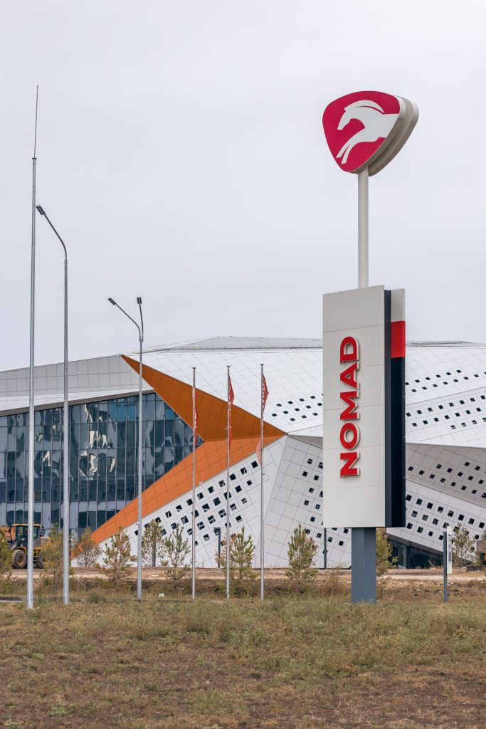
We managed to create a new design of the gas station, which reflects the energy and nomadic spirit of the flagship, the dynamics of its development and constant movement forward. When creating the Nomad corporate identity, the Customer personally participated in setting goals and developing the style.
